Kitchen Wainscoting Color Ideas
Choosing the right color for kitchen wainscoting can completely transform the look and feel of your space. Wainscoting, a decorative paneling applied to the lower part of walls, not only adds architectural interest but also protects walls from daily wear and tear. While traditional kitchens often feature white or neutral wainscoting, modern design trends encourage bolder choices that reflect personal style and complement existing cabinetry, countertops, and flooring. Understanding the range of color options and how they interact with your kitchen’s overall aesthetic is essential for creating a cohesive, stylish look that elevates both small and large spaces.
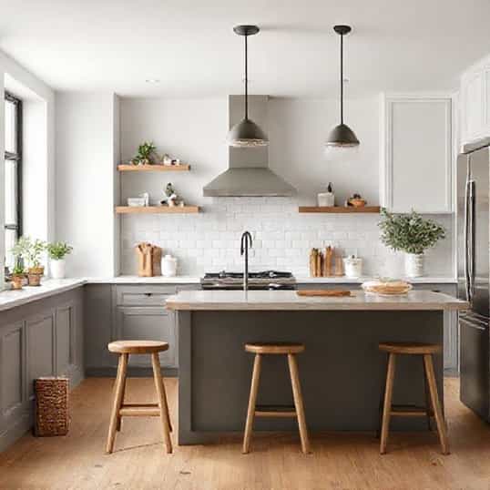
Classic White and Cream Shades
White and cream wainscoting colors remain timeless choices for any kitchen. These light, neutral shades brighten the space, make rooms feel larger, and pair seamlessly with various cabinet finishes and countertop materials. White wainscoting works particularly well in kitchens with colorful or patterned backsplashes, allowing the details of the wall paneling to stand out without overwhelming the space. Cream shades add warmth and softness, creating a cozy and inviting atmosphere perfect for both traditional and farmhouse-style kitchens.
Tips for Using White or Cream Wainscoting
- Use a high-gloss finish for a polished, easy-to-clean surface in busy kitchens.
- Pair with soft gray or pastel wall colors to maintain a subtle contrast.
- Consider white wainscoting with darker hardwood floors for a classic, elegant look.
Soft Gray Tones
Gray has become one of the most popular color choices for kitchen wainscoting in contemporary homes. Soft gray tones provide a neutral backdrop that adds sophistication without overpowering other design elements. Gray wainscoting can balance bold wall colors or patterned wallpapers and works beautifully alongside stainless steel appliances or marble countertops. This versatile shade can fit both modern and traditional kitchens, offering a polished look while maintaining warmth.
Pairing Ideas with Gray Wainscoting
- Combine with white upper walls for a clean, two-tone effect.
- Use darker gray or navy cabinets for a dramatic contrast.
- Accent with brushed metal hardware to enhance the modern feel.
Bold and Dark Hues
For homeowners seeking a statement-making kitchen, dark and bold wainscoting colors are an excellent choice. Deep navy, charcoal, or forest green wainscoting can create a striking visual impact and add depth to the room. Dark shades work particularly well in larger kitchens or spaces with plenty of natural light, preventing the color from feeling heavy. Pairing these wainscoting colors with lighter countertops or wall colors creates a balanced and sophisticated aesthetic.
Styling Bold Wainscoting
- Contrast with light walls or cabinetry to avoid making the space feel smaller.
- Add brass or gold fixtures to enhance the richness of dark wainscoting.
- Incorporate natural wood accents to soften the overall look.
Pastel and Muted Shades
Pastel and muted colors like soft mint, pale blue, or blush pink are perfect for kitchens seeking a playful yet subtle touch. These shades add personality without overwhelming the space, making them ideal for cottage-style or Scandinavian-inspired kitchens. Lightly colored wainscoting can also complement white cabinets and light wood flooring, creating a cheerful and airy ambiance. Muted shades provide a fresh alternative to traditional neutrals while maintaining versatility and timeless appeal.
Tips for Pastel Wainscoting
- Pair with neutral wall colors to let the wainscoting pop.
- Use matte or satin finishes for a soft, delicate appearance.
- Combine with vintage or minimalist décor for a cohesive look.
Two-Tone and Contrasting Combinations
Using two-tone colors for wainscoting and walls can add dimension and style to a kitchen. A darker wainscoting color paired with a lighter upper wall creates visual interest and draws attention to the architectural detail. For example, a navy wainscoting with soft beige walls or charcoal wainscoting with pale gray walls can make a kitchen feel more dynamic. This approach allows you to mix classic and contemporary elements while keeping the space visually appealing and balanced.
Creative Two-Tone Ideas
- Experiment with complementary color schemes for a harmonious effect.
- Use a pop of color on the wainscoting to highlight kitchen islands or feature walls.
- Consider adding decorative molding or trim in a contrasting color for extra dimension.
Natural Wood and Earthy Tones
Natural wood tones or earthy shades like warm taupe, terracotta, or olive green can bring a sense of organic warmth to a kitchen. Wooden wainscoting adds texture and richness, pairing beautifully with stone countertops, ceramic tiles, or open shelving. Earthy colors are especially suitable for kitchens with rustic, farmhouse, or bohemian designs, creating a welcoming environment that feels connected to nature.
Enhancing Natural and Earthy Wainscoting
- Choose stain finishes that highlight the wood grain for a more authentic look.
- Pair with neutral or cream walls to maintain balance.
- Incorporate greenery and natural textiles to complement the earthy palette.
Metallic and Glossy Finishes
Metallic or glossy finishes are a modern twist on traditional wainscoting. Silver, gold, or copper tones can add subtle glamour and reflect light, making the kitchen appear larger and more luxurious. Glossy finishes in bold colors like teal or burgundy can create a contemporary feel while protecting walls from stains and splashes. These finishes work best when used as an accent or in combination with more subdued tones to prevent overwhelming the space.
Metallic Wainscoting Tips
- Use sparingly to highlight specific areas such as islands or breakfast nooks.
- Combine with matte walls for contrast and depth.
- Consider coordinating with metallic hardware and lighting fixtures for a cohesive design.
Final Considerations
When choosing a wainscoting color for your kitchen, it’s important to consider the size of the room, lighting, existing cabinetry, and overall design style. Testing samples on the wall can help visualize how the color interacts with natural and artificial light. Additionally, mixing textures and finishes can add dimension and prevent the space from feeling flat. Whether you prefer timeless neutrals, bold statement colors, or playful pastels, the right wainscoting color can elevate your kitchen’s aesthetic and provide lasting beauty for years to come.