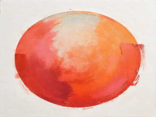
Impressionistic Painting That Uses Relative Color
Impressionistic painting revolutionized the way artists approached color, light, and perception in the late 19th century. One of the key techniques used in Impressionism is the application of relative color, where colors are perceived not in isolation but in relation to surrounding hues and lighting conditions. This approach allows artists to create vibrancy, depth, and atmospheric effects that evoke emotion and movement rather than precise detail. Impressionistic painters often painted en plein air, directly observing natural light and its shifting qualities. Using relative color, they could capture fleeting moments, from the warmth of sunlight to the cool shadows of a tree, creating works that feel alive and dynamic. Understanding the principles of relative color is essential for appreciating the complexity and subtlety of Impressionistic painting.
Understanding Relative Color in Impressionism
Relative color refers to the perception of a color depending on its surrounding colors, lighting, and context. Unlike classical painting, which often relies on predetermined color schemes and exact replication, Impressionists explored how colors interact visually. For instance, a shadow on a white wall may appear blue if the surrounding light has warm tones, or a green leaf might appear brighter against a darker background. By observing these relationships, Impressionists could convey more realistic lighting effects and optical phenomena without relying on detailed lines or shading. Relative color allows the viewer’s eye to blend pigments optically, creating a sense of luminosity and life that traditional techniques often lacked.
Historical Context of Impressionistic Color
The development of relative color in Impressionism emerged alongside scientific discoveries about optics and human perception. Artists such as Claude Monet, Pierre-Auguste Renoir, and Camille Pissarro were influenced by contemporary theories of color contrast and complementary colors. They experimented with short, broken brushstrokes of pure, unmixed pigments, allowing the viewer’s eye to mix the colors from a distance. This method highlighted the relationships between light, color, and environment, giving Impressionist works a shimmering, ephemeral quality. The approach marked a departure from academic painting, emphasizing the perception of a scene over exact replication.
Techniques for Using Relative Color
Impressionistic painters employed several techniques to make the most of relative color. Understanding and applying these methods is key to capturing the vibrancy characteristic of this style.
1. Broken Brushwork
Instead of blending colors on a palette, artists often used small, distinct brushstrokes to place pure pigments side by side. When viewed from a distance, these strokes visually blend, creating the desired color effects and depth. Broken brushwork allows artists to play with relative color by positioning contrasting or complementary hues adjacent to each other, which enhances vibrancy and movement. For example, Monet’s water lily series demonstrates how blue, green, and violet strokes interact to suggest reflections and shifting light.
2. Observation of Natural Light
Relative color depends heavily on the lighting conditions of the scene. Impressionists often painted outdoors to observe changes in sunlight, shadow, and atmospheric conditions. The same object may appear differently at sunrise, midday, or sunset due to subtle shifts in color temperature. By observing these changes, painters could adjust their palette dynamically, applying warm tones to areas lit by sunlight and cooler hues to shaded areas. Capturing the nuances of light is central to the success of relative color in Impressionistic painting.
3. Use of Complementary Colors
Complementary colors, or pairs of colors opposite each other on the color wheel, are essential in creating relative color effects. By placing complementary colors next to one another, artists increase contrast and make the colors appear more vibrant. For example, red next to green or blue beside orange creates visual tension and energy. Impressionists exploited these interactions to create a sense of depth, light, and emotional intensity without relying on traditional shading techniques.
Examples of Impressionistic Relative Color
Several iconic Impressionist works demonstrate mastery of relative color. Claude Monet’s Impression, Sunrise showcases how the orange sun is intensified against the cool blues of the harbor and sky. The juxtaposition of warm and cool tones creates a luminous, shimmering effect that seems to move as the viewer’s eyes scan the painting. Similarly, Renoir’s portraits often use pinks and blues in skin tones, contrasting with clothing or background elements, allowing the human form to glow with life and warmth. These examples reveal how relative color transforms ordinary scenes into dynamic visual experiences.
Practical Tips for Artists
- Paint directly from observation to capture natural variations in light and color.
- Use pure, unmixed pigments in small strokes to allow optical blending.
- Experiment with placing complementary colors side by side for increased vibrancy.
- Observe shadows and highlights carefully, noting how surrounding colors affect perception.
- Step back frequently to see how relative colors interact across the composition.
Benefits of Using Relative Color in Painting
Working with relative color offers several advantages for artists. It allows for more naturalistic depictions of light and atmosphere, providing depth and luminosity without relying on heavy blending or traditional perspective techniques. Relative color encourages experimentation and observation, enhancing an artist’s sensitivity to subtle shifts in tone and hue. Additionally, this approach gives paintings a sense of immediacy and energy, which is why Impressionist works often feel alive and spontaneous. By understanding and applying relative color, artists can evoke mood, emotion, and a sense of place more effectively.
Challenges and Considerations
While relative color opens creative possibilities, it also presents challenges. It requires careful observation and a willingness to experiment with unconventional color choices. Beginners may find it difficult to resist blending colors on the palette, but trusting the optical mixing of adjacent strokes is crucial. Lighting conditions can also be unpredictable, especially in outdoor settings, so flexibility and adaptability are key. Despite these challenges, mastering relative color can elevate an artist’s work, creating compositions that resonate with viewers and capture the essence of a scene.
Impressionistic painting that uses relative color represents a shift from traditional techniques toward a more perceptual and expressive approach. By focusing on the relationships between colors, light, and environment, artists can create luminous, dynamic works that convey emotion and movement. Techniques such as broken brushwork, observing natural light, and using complementary colors are essential for achieving the desired effects. Iconic works by Monet, Renoir, and other Impressionists exemplify the power of relative color, showing how ordinary scenes can be transformed into vibrant visual experiences. Understanding and applying these principles allows artists to capture the fleeting beauty of the world and create paintings that feel alive and full of light.