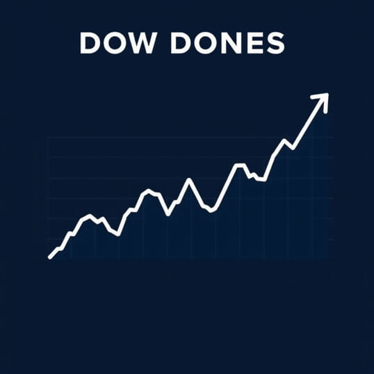
Dow Jones Historical Chart
The Dow Jones Industrial Average (DJIA) is one of the most widely followed stock market indices in the world, and its historical chart provides valuable insights into the evolution of the financial markets over more than a century. By examining the Dow Jones historical chart, investors, analysts, and economists can track long-term trends, understand market cycles, and evaluate the impact of major economic and political events on stock prices. Historical data helps contextualize short-term fluctuations, giving both new and experienced investors a better understanding of market behavior. From the Great Depression to modern financial crises, the Dow Jones historical chart illustrates the resilience and volatility inherent in the stock market.
Understanding the Dow Jones Historical Chart
The Dow Jones historical chart represents the performance of the 30 large, publicly traded companies that make up the Dow Jones Industrial Average over time. Unlike a single company’s stock chart, this index reflects broader market trends by aggregating the performance of multiple blue-chip companies. The chart typically shows closing prices, daily highs and lows, and overall index movement across decades, allowing viewers to identify patterns, peaks, and troughs that characterize market history.
Key Components of the Dow Jones Historical Chart
- Closing ValuesThe final value of the DJIA at the end of each trading day, which is most commonly used for historical analysis.
- Highs and LowsThe highest and lowest points reached by the index during each trading session, useful for understanding market volatility.
- TrendsUpward or downward movements over days, months, or years, which help identify bull or bear markets.
- Volume DataWhile not always included in every chart, trading volume provides insight into investor interest and market activity.
Historical Milestones in the Dow Jones
The Dow Jones historical chart highlights several critical periods in financial history, reflecting both economic growth and downturns. By studying these milestones, investors gain perspective on how markets have responded to external events and policy decisions.
The Great Depression (1929-1939)
The stock market crash of 1929 marked the beginning of the Great Depression. The Dow Jones historical chart shows a dramatic decline in index values, losing nearly 90% from its peak in 1929 to the bottom in 1932. This period demonstrates the impact of economic instability, widespread unemployment, and bank failures on investor confidence. Despite the severe downturn, the subsequent years saw gradual recovery, illustrating the long-term resilience of the market.
Post-War Expansion (1945-1965)
Following World War II, the Dow Jones historical chart reflects a period of strong economic growth, industrial expansion, and increased consumer spending. The index experienced consistent upward trends, driven by industrial development, technological advancements, and a growing middle class. This era highlights how favorable economic conditions can produce sustained market growth.
The 1970s Stagflation
The 1970s were marked by stagflation, a combination of high inflation and slow economic growth. The Dow Jones historical chart during this decade shows periods of stagnation and volatility. Rising oil prices, geopolitical tensions, and monetary policy challenges contributed to fluctuations in index values. This period serves as an example of how macroeconomic pressures can influence market performance.
1987 Market Crash
On October 19, 1987, also known as Black Monday, the Dow Jones experienced its largest one-day percentage drop in history, falling more than 22%. The historical chart captures this sharp decline, highlighting the potential for sudden market shocks even during periods of overall growth. Recovery in the subsequent months emphasized the market’s ability to rebound from extreme events.
Dot-Com Bubble and Early 2000s
The late 1990s saw the rise of technology stocks, creating the dot-com bubble. The Dow Jones historical chart shows rapid growth followed by a sharp decline between 2000 and 2002. Many technology and internet companies lost significant value, impacting overall market sentiment. This period underscores the importance of diversification and caution during speculative booms.
2008 Financial Crisis
The global financial crisis of 2008 is another pivotal moment captured in the Dow Jones historical chart. Triggered by the collapse of major financial institutions and the housing market crash, the index fell dramatically. This period highlights systemic risks in the financial sector and the role of government intervention in stabilizing markets. The recovery that followed illustrates the long-term potential for growth even after severe crises.
Analyzing Trends in the Dow Jones Historical Chart
Investors can extract valuable insights by analyzing the trends shown in the Dow Jones historical chart. Understanding both long-term trends and short-term fluctuations helps guide investment decisions, risk management, and portfolio diversification strategies.
Bull and Bear Markets
The chart helps identify bull markets, characterized by sustained upward trends, and bear markets, defined by prolonged declines. Recognizing these patterns enables investors to anticipate potential risks and opportunities, adjusting strategies to market conditions.
Support and Resistance Levels
Historical peaks and troughs act as support and resistance levels. These levels provide reference points for predicting potential future movements. For example, a previous peak may act as resistance, limiting upward movement, while a historical low can provide a floor for prices.
Impact of External Events
The Dow Jones historical chart demonstrates how events such as wars, recessions, technological innovations, and policy changes influence market performance. Investors can use historical reactions to similar events as a guide for decision-making in current market conditions.
Using the Dow Jones Historical Chart for Investment Decisions
Historical charts are essential tools for both individual and institutional investors. They provide context for market behavior, help identify trends, and support technical analysis strategies. By integrating historical data with other forms of research, investors can make more informed decisions and manage risk more effectively.
Long-Term Investing
Long-term investors can use the Dow Jones historical chart to identify periods of growth and stability, guiding investment decisions focused on wealth accumulation over decades. Understanding historical cycles helps investors remain patient during market downturns.
Technical Analysis
Traders use historical charts for technical analysis, studying patterns, moving averages, and price momentum. The Dow Jones historical chart provides a rich dataset for identifying trends, making it a crucial tool for short- and medium-term trading strategies.
Risk Management
By studying past market crashes and corrections, investors can better assess risk and prepare for potential downturns. Historical data informs strategies such as portfolio diversification, stop-loss orders, and hedging techniques to protect investments.
The Dow Jones historical chart is more than just a record of past index values; it is a powerful tool for understanding market behavior, analyzing trends, and making informed investment decisions. From the Great Depression to modern market fluctuations, the chart provides insights into economic cycles, investor sentiment, and external factors that influence stock performance. Whether used for long-term investing, technical analysis, or risk management, the Dow Jones historical chart offers valuable lessons for navigating the complexities of financial markets. By studying historical data, investors gain perspective, improve decision-making, and increase their chances of achieving financial success in a dynamic and often unpredictable market environment.