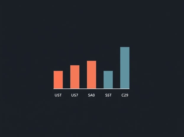
Example Of Pareto Chart
Pareto charts are an essential tool in quality management, business analytics, and process improvement. They allow organizations to visualize and prioritize problems or causes by frequency or impact, following the Pareto principle, which states that roughly 80% of effects come from 20% of causes. Understanding examples of Pareto charts can help managers, students, and professionals identify the most critical issues in a system, allocate resources effectively, and make data-driven decisions. By representing data visually, Pareto charts simplify complex information, making patterns and priorities clear and actionable.
Definition of a Pareto Chart
A Pareto chart is a type of bar graph in which values are plotted in descending order of frequency or impact, alongside a cumulative percentage line. It combines both bars and a line graph, helping users quickly identify which problems or causes are most significant. The primary purpose of a Pareto chart is to highlight the vital few issues that contribute most to an outcome, distinguishing them from the trivial many that have minor effects. This tool is widely used in quality control, business process management, and project analysis.
Characteristics of a Pareto Chart
- Bars represent individual causes or problems arranged in descending order.
- A cumulative percentage line shows the overall contribution of the causes.
- Helps identify the most significant factors affecting a process or outcome.
- Visualizes complex data in an easy-to-understand format.
- Supports decision-making and prioritization in problem-solving.
Examples of Pareto Charts
Examples of Pareto charts illustrate how organizations and individuals can use this tool to analyze data, identify key issues, and improve processes. By looking at real-world applications, one can better understand the versatility and usefulness of Pareto charts.
1. Manufacturing Defects
In a manufacturing setting, a company might track defects in a production line to improve product quality. A Pareto chart could display various defects, such as scratches, misalignments, missing components, and packaging errors. The bars are arranged from the most frequent defect to the least, with a cumulative percentage line showing the overall impact. For example, the chart might reveal that 80% of defects come from only 20% of the causes, such as misalignments and missing components. This insight allows managers to focus on solving the most critical quality issues first.
2. Customer Complaints
Service-oriented businesses can use Pareto charts to analyze customer complaints. For instance, a telecom company might categorize complaints into billing errors, network issues, slow customer service, and account setup problems. The Pareto chart would show which complaint categories occur most frequently and contribute most to dissatisfaction. The company might find that network issues and billing errors account for 70% of complaints, highlighting the areas that require immediate attention to improve customer satisfaction.
3. Workplace Accidents
Safety managers can employ Pareto charts to reduce workplace accidents. By categorizing accidents into slips, falls, equipment malfunctions, and chemical exposures, a Pareto chart can reveal which causes are most common. For example, the chart might show that slips and falls constitute the majority of incidents, prompting management to implement better safety protocols, signage, and employee training. This approach ensures resources are directed where they can have the greatest impact on safety.
4. Inventory Issues
In retail or warehouse management, a Pareto chart can track inventory issues such as stockouts, overstock, damaged goods, and mislabeling. By plotting these issues in descending order, managers can identify which problems cause the most significant disruptions or costs. The cumulative percentage line helps illustrate that a small number of problem types may account for the majority of inventory challenges, allowing for targeted interventions that improve overall efficiency.
Steps to Create a Pareto Chart
Creating a Pareto chart involves several straightforward steps, enabling businesses and individuals to visualize data effectively. Understanding these steps makes it easier to generate meaningful charts and interpret results accurately.
Step 1 Identify and List Causes or Problems
The first step is to identify the specific causes, defects, or issues to be analyzed. For example, in a production line, list all observed defects or process errors. Accurate identification ensures the chart reflects actual priorities rather than assumptions.
Step 2 Collect Data
Gather data on the frequency or impact of each cause. This might involve counting occurrences, measuring financial costs, or assessing the severity of each problem. Reliable data collection is crucial for the chart’s accuracy and usefulness.
Step 3 Sort Data in Descending Order
Arrange the causes from the most frequent or impactful to the least. Sorting helps to clearly visualize which issues contribute the most to the overall problem, adhering to the Pareto principle of vital few, trivial many.
Step 4 Calculate Cumulative Percentages
Compute the cumulative percentage of the total impact or frequency for each cause. This allows the addition of a line graph over the bars, showing how each successive cause contributes to the cumulative effect.
Step 5 Draw the Chart
Plot the bars representing each cause along the horizontal axis, with the vertical axis showing frequency or impact. Overlay a line graph representing the cumulative percentage. Label each bar and line point clearly for easy interpretation.
Benefits of Using a Pareto Chart
Pareto charts provide multiple benefits in data analysis, decision-making, and process improvement. By visually highlighting key issues, they help organizations focus on what matters most.
Prioritization of Problems
Pareto charts allow managers and teams to focus on the most significant issues that contribute to most of the problems. This prioritization is efficient and ensures that resources are used effectively.
Improved Decision-Making
By providing a clear visual representation of data, Pareto charts support informed decision-making. Leaders can quickly see which problems require immediate attention and which are less critical, enabling strategic planning and action.
Enhanced Communication
Pareto charts make complex data more understandable, facilitating communication among team members, stakeholders, and management. Visual representation often conveys information more effectively than tables or raw numbers alone.
Focus on Continuous Improvement
In quality management frameworks such as Six Sigma and Lean, Pareto charts are invaluable for continuous improvement initiatives. They help track recurring issues, monitor improvements over time, and adjust processes to maintain high efficiency and quality standards.
Real-World Applications of Pareto Charts
Pareto charts are widely used across industries, from manufacturing and healthcare to service and retail sectors. In healthcare, they might analyze patient complaints or medical errors to improve care quality. In retail, they identify the most frequent inventory or sales issues. In education, Pareto charts can track student performance problems or resource allocation. These real-world applications demonstrate the versatility and practicality of Pareto charts for decision-making and problem-solving.
Challenges in Using Pareto Charts
While Pareto charts are powerful tools, they have limitations. Accurate data collection is critical; incomplete or biased data can misrepresent priorities. Additionally, some issues may have long-term impacts not captured by frequency alone. Users must interpret charts carefully and combine them with other analytical methods for comprehensive insights.
Examples of Pareto charts illustrate their usefulness in identifying and prioritizing the most significant problems or causes within a system. From manufacturing defects to customer complaints, workplace accidents, and inventory issues, Pareto charts help managers and professionals focus on the vital few that drive most of the effects. By visualizing data with descending bars and a cumulative percentage line, these charts simplify complex information, enhance decision-making, and support continuous improvement. Understanding and applying Pareto charts effectively empowers organizations to optimize processes, allocate resources wisely, and achieve better results in diverse fields.
2/2