Is Primrose A Color
Primrose is a term often heard in the world of flowers, fashion, and interior design, but many people wonder if it is truly a color. Derived from the delicate blossoms of the primrose plant, this term has evolved to describe a soft, pale yellow hue that evokes feelings of freshness, warmth, and optimism. While it is commonly associated with springtime and floral arrangements, primrose has gained recognition as a color in its own right, appearing in home décor, clothing, and graphic design. Understanding primrose as a color involves examining its characteristics, history, applications, and how it compares to other similar shades.
The Origin of Primrose
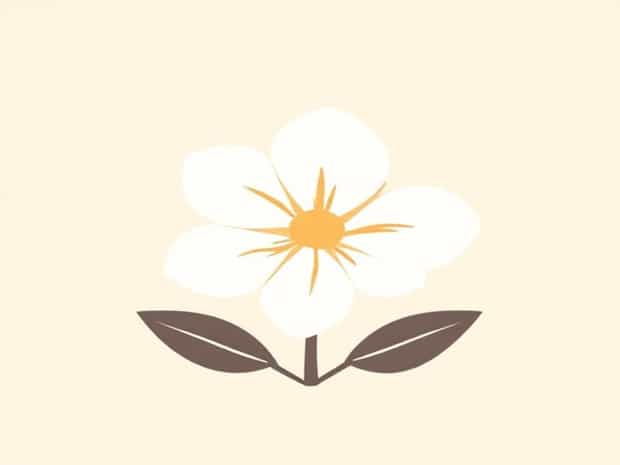
The word primrose originates from the Latin termprima rosa, meaning first rose, reflecting the flower’s early bloom in spring. The primrose flower itself has delicate yellow petals that range from pale to slightly richer shades, inspiring the use of the term to describe this soft yellow color. Over time, the concept of primrose expanded beyond botany, influencing art, fashion, and design. Designers and artists began using primrose to convey lightness, cheerfulness, and natural beauty.
Primrose as a Color
Primrose is recognized as a color in modern design and fashion circles. It is generally classified as a pale, pastel yellow, though it can carry subtle variations, including hints of green or cream. Unlike bright yellow, which can be bold and intense, primrose is softer, calming, and more versatile. It is often used to create a sense of warmth and positivity without overwhelming other colors in a palette. The color evokes natural elements, making it ideal for spring-themed designs and serene environments.
Characteristics of Primrose
- HuePale yellow with potential soft undertones of green or cream.
- BrightnessSoft and light, providing a gentle visual impact.
- VersatilityWorks well in fashion, interior design, graphic design, and floral arrangements.
- AssociationsLinked with spring, renewal, warmth, and cheerfulness.
Primrose in Fashion and Design
Primrose has been embraced by fashion designers and interior decorators for its soft, inviting qualities. In clothing, primrose can appear in spring collections, dresses, blouses, and accessories, providing a subtle pop of color that is feminine and elegant. The shade pairs well with neutral tones like beige, ivory, and gray, as well as other pastel colors such as lavender, mint, or peach. In interior design, primrose is often used on walls, furniture, or décor items to create light-filled, cheerful spaces. Its calming nature makes it suitable for bedrooms, living rooms, and nurseries, where it promotes a serene yet uplifting environment.
Primrose in Art and Graphic Design
Artists and graphic designers use primrose to evoke a sense of freshness and positivity. The color can be used as a background, accent, or primary element to convey warmth and energy without being overpowering. In digital design, primrose can complement both muted and vibrant color schemes, making it a versatile choice for websites, branding, and marketing materials. Its association with natural elements also makes it ideal for eco-friendly brands or designs inspired by springtime and floral motifs.
Comparison with Similar Colors
Primrose is often compared to other yellow shades, including pastel yellow, lemon, buttercup, and cream. While these colors share similarities, primrose is distinct for its pale, slightly muted quality. Pastel yellow may appear brighter, lemon tends to be more vibrant, buttercup has a richer tone, and cream leans more toward white. Primrose sits comfortably in between these shades, offering a soft, natural look that is gentle on the eyes while still being recognizable as a distinct yellow hue.
Why Primrose is Popular
The popularity of primrose stems from its versatility and psychological impact. Pale yellow tones like primrose are associated with happiness, optimism, and creativity. They can brighten spaces, complement other colors, and evoke feelings of renewal and energy, making them highly desirable in fashion, home décor, and design projects. Additionally, primrose is timeless and can be incorporated into both contemporary and traditional settings, demonstrating its enduring appeal.
Tips for Using Primrose Effectively
- Pair primrose with neutral tones to create a soft, balanced look in interiors or fashion ensembles.
- Combine primrose with complementary pastels such as lavender or mint for spring-themed designs.
- Use primrose as an accent color to add warmth and brightness without dominating the overall color scheme.
- Consider lighting and material when applying primrose in home décor, as natural light can enhance its soft, cheerful qualities.
Primrose is more than just the name of a flower; it is a recognized and versatile color with a range of applications in fashion, design, and art. Its pale yellow hue with subtle undertones conveys warmth, optimism, and freshness, making it suitable for a variety of settings. By understanding the characteristics, history, and potential uses of primrose, designers, artists, and homeowners can effectively incorporate this charming color into their projects. Whether used as a primary color or an accent, primrose brings a soft, cheerful touch that embodies the beauty and renewal of spring.