Histogram With Unequal Class Intervals
When working with statistical data, histograms are one of the most effective tools to visualize frequency distributions. However, while most basic histograms use equal class intervals, real-world data often requires flexibility, and that is where a histogram with unequal class intervals becomes essential. This method helps in representing skewed data, irregular groupings, or situations where some classes cover broader ranges than others. By constructing histograms with unequal class widths, analysts can preserve the accuracy of data interpretation and highlight meaningful trends that might otherwise remain hidden.
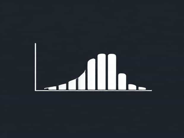
Understanding Histograms
A histogram is a graphical representation of data distribution using bars. Each bar represents the frequency of values falling within a specific interval or class. Typically, histograms use equal intervals for simplicity, but in practice, not all data lends itself to equal divisions. For example, income ranges, age groups, or measurement scales might naturally require uneven categories to make sense of the data.
Equal vs. Unequal Class Intervals
In an equal interval histogram, every bar represents the same range of values, such as 0-10, 10-20, 20-30, and so on. This approach is straightforward but sometimes misleading if the dataset has irregular ranges. A histogram with unequal class intervals, on the other hand, adjusts bar widths to match different ranges, ensuring all data is properly represented.
- Equal class intervalsEasier to construct and interpret but may oversimplify complex datasets.
- Unequal class intervalsMore accurate for real-world data where some categories naturally cover larger or smaller ranges.
When to Use Unequal Class Intervals
Not every dataset requires unequal intervals. However, in some cases, it becomes the most effective way to display data without distortion. Common situations include
- When data distribution is skewed, and equal intervals would result in too many empty bars.
- When categories like income levels, population groups, or production ranges vary significantly.
- When analysts want to focus on particular ranges that carry more importance than others.
- When the dataset is too broad, and equal intervals would hide critical details in smaller ranges.
How to Construct a Histogram with Unequal Class Intervals
Constructing this type of histogram requires careful planning. The steps differ slightly from standard histograms because the varying class widths must be accounted for in the frequency density.
Step 1 Organize the Data
Arrange the dataset into class intervals. For unequal intervals, choose ranges that reflect the data distribution, such as 0-10, 10-20, 20-50, 50-100, and so on.
Step 2 Calculate Frequency
Determine how many data points fall into each interval. This gives you the raw frequency for each class.
Step 3 Compute Frequency Density
Since the intervals have different widths, the height of each bar is not determined by frequency alone. Instead, use the formula
Frequency Density = Frequency ÷ Class Width
This ensures that wider intervals do not distort the histogram and that the area of each bar is proportional to the frequency it represents.
Step 4 Draw the Histogram
On the x-axis, place the class intervals with varying widths. On the y-axis, use frequency density instead of raw frequency. Draw bars with widths corresponding to the intervals and heights determined by the frequency density.
Advantages of Using Unequal Class Intervals
While slightly more complex, histograms with unequal intervals offer multiple benefits
- They allow for accurate representation of datasets with irregular distributions.
- They highlight details in important ranges while compressing less significant areas.
- They prevent misleading visualizations that might arise from empty or sparsely filled bars.
- They provide more flexibility in handling broad or complex datasets.
Challenges and Considerations
Although effective, unequal class intervals require caution. Some challenges include
- ComplexityThey are harder to construct compared to equal intervals.
- InterpretationViewers unfamiliar with frequency density may misinterpret the bar heights.
- ConsistencyIf class intervals are chosen poorly, the visualization can exaggerate or minimize certain aspects of the data.
Examples of Unequal Class Interval Usage
To illustrate, consider income data for a population. Equal intervals of $10,000 might work for lower incomes but fail to capture the distinction at higher levels where incomes span from $100,000 to millions. By creating unequal intervals such as 0-20,000, 20,000-40,000, 40,000-100,000, and 100,000-500,000, the histogram becomes much clearer.
Another example is age distribution in a health study. Equal age ranges might not reflect the importance of early childhood or older age groups. Using intervals like 0-5, 6-18, 19-35, 36-60, and 61+ provides more meaningful insights.
Practical Applications
Histograms with unequal class intervals are widely used across industries. Some applications include
- BusinessUnderstanding customer income levels or spending patterns.
- EducationDisplaying test scores where higher marks are less frequent.
- HealthcareAnalyzing patient age groups or disease prevalence.
- EngineeringVisualizing error ranges or measurement tolerances.
Tips for Creating Effective Histograms with Unequal Intervals
To make the most of this visualization method, consider the following tips
- Always calculate frequency density instead of using raw frequency.
- Choose class intervals that reflect the nature of your data without creating unnecessary complexity.
- Label axes clearly to avoid confusion between frequency and frequency density.
- Use consistent scaling to maintain accuracy across different intervals.
- Provide a clear explanation in accompanying text when presenting to a general audience.
A histogram with unequal class intervals is a valuable tool for data analysis when the dataset does not fit neatly into equal ranges. By focusing on frequency density and proportional representation, this method ensures accuracy and clarity in visualizing distributions. While it requires careful planning and clear explanation, the results can reveal patterns and insights that would otherwise be overlooked. Whether applied in business, education, healthcare, or research, this approach enhances the ability to understand complex data and make informed decisions.